Jeffrey Joyal’s Set Design for Warm Up 2025
- Texto
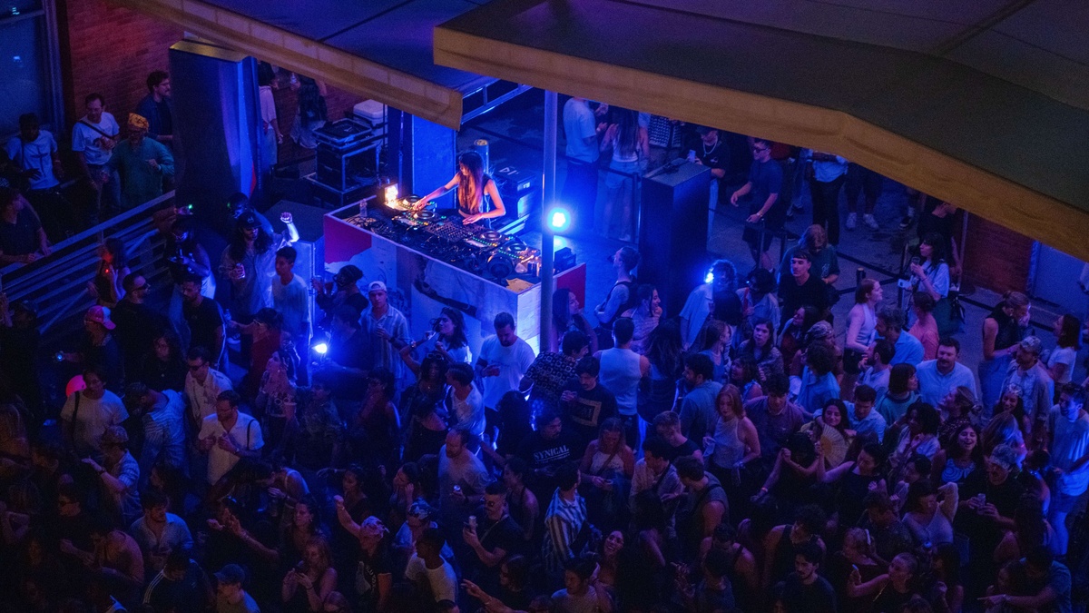
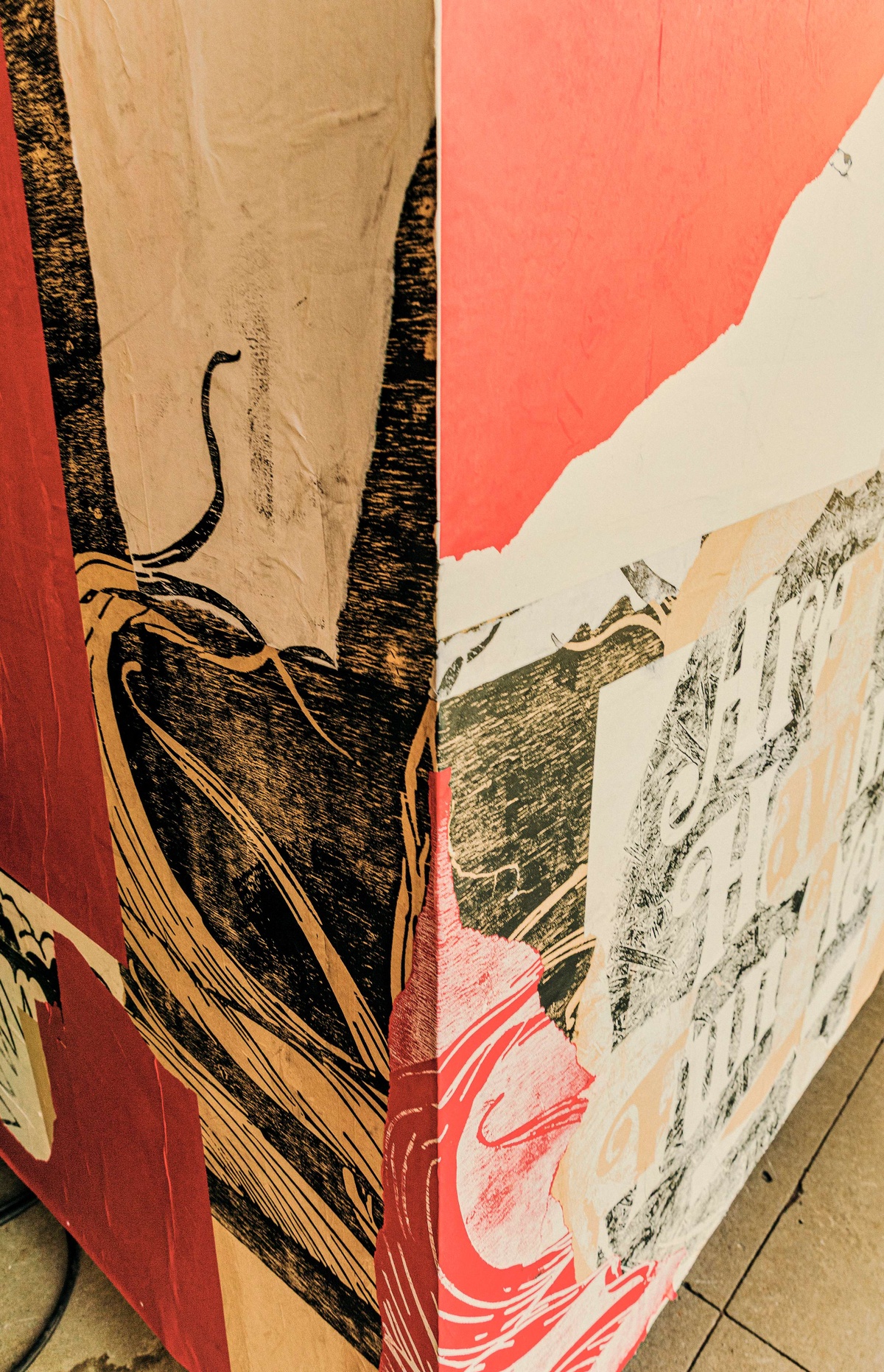
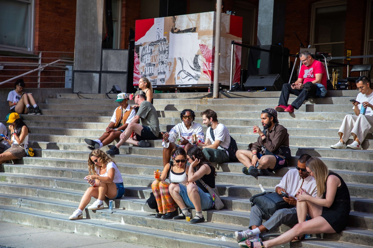
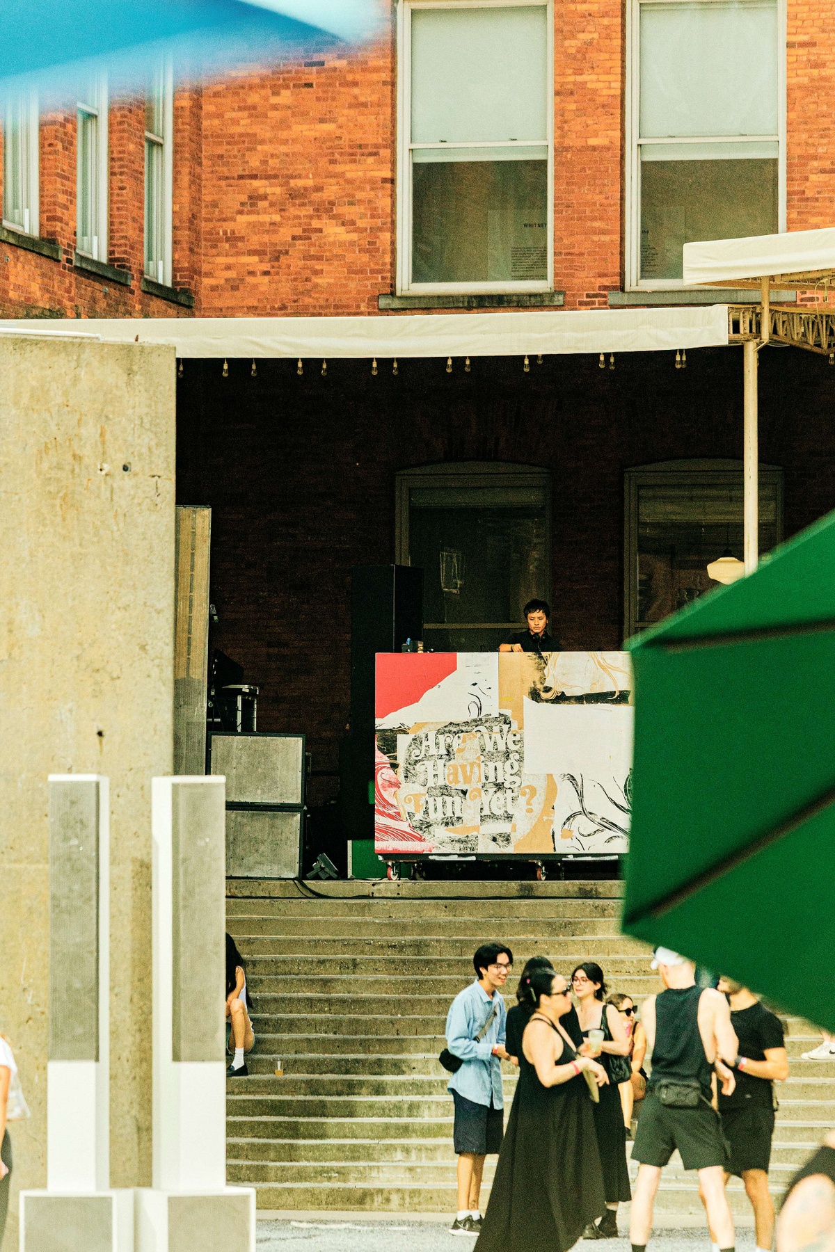
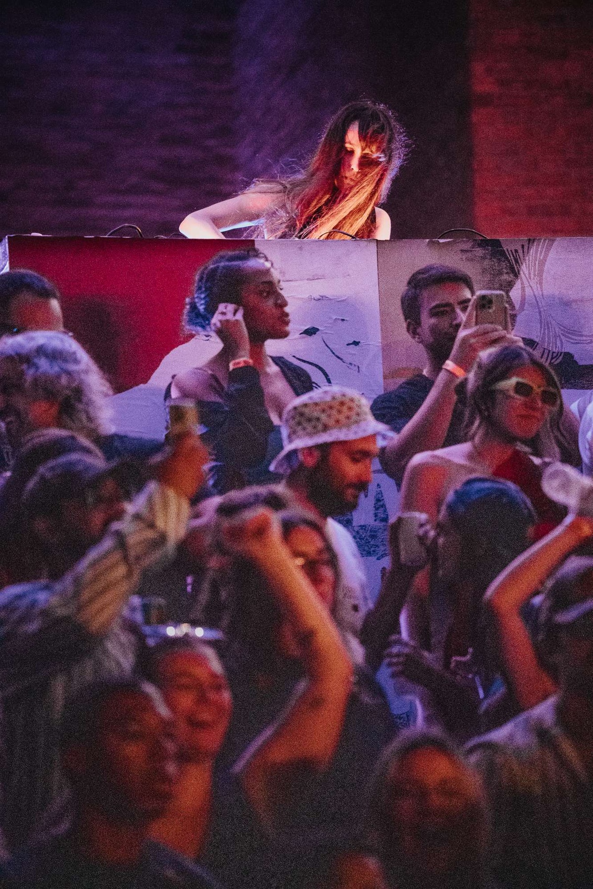
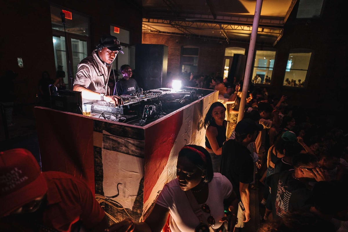
New York City-based artist and musician Jeffrey Joyal designed the 2025 Warm Up stage, which consists of two distinct parts. The first is the series of layered (and weathered) woodcut prints wheatpasted directly onto the DJ booth, where the season’s artists perform in the MoMA PS1 courtyard on Friday evenings. Joyal’s prints reference the history of DIY-graphics production for events ranging from punk shows in NYC to leftist counterculture in the Bay area and the Atelier Populaire in Paris.
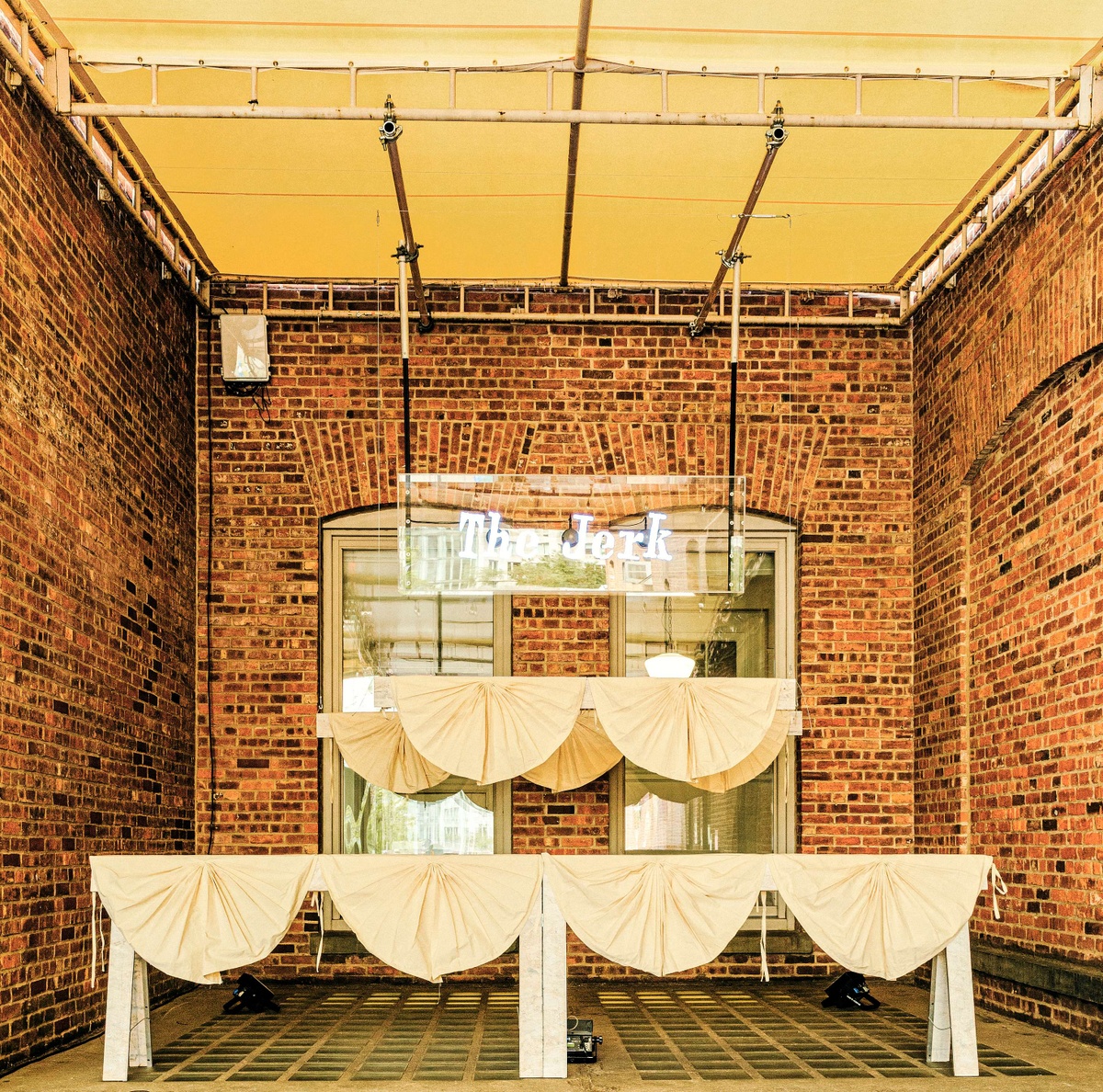
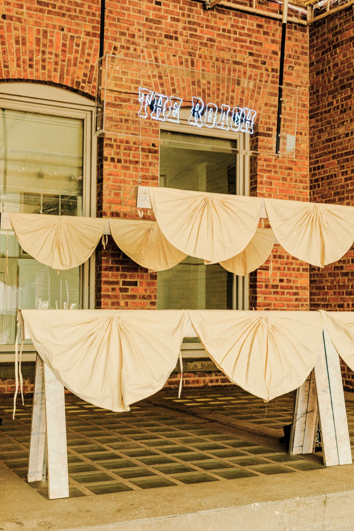
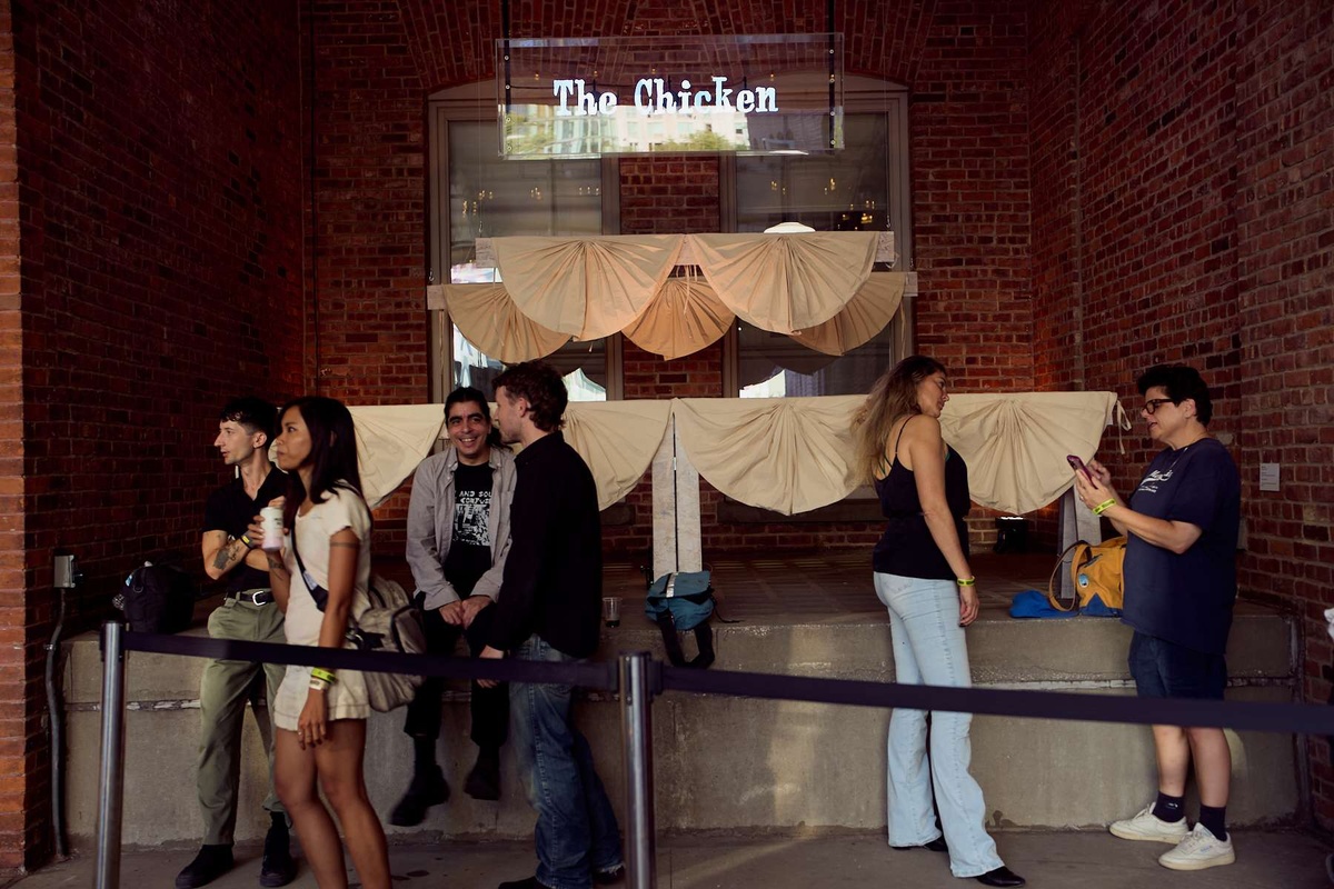
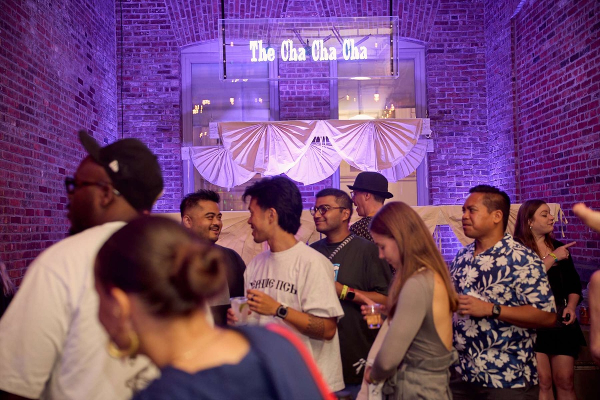
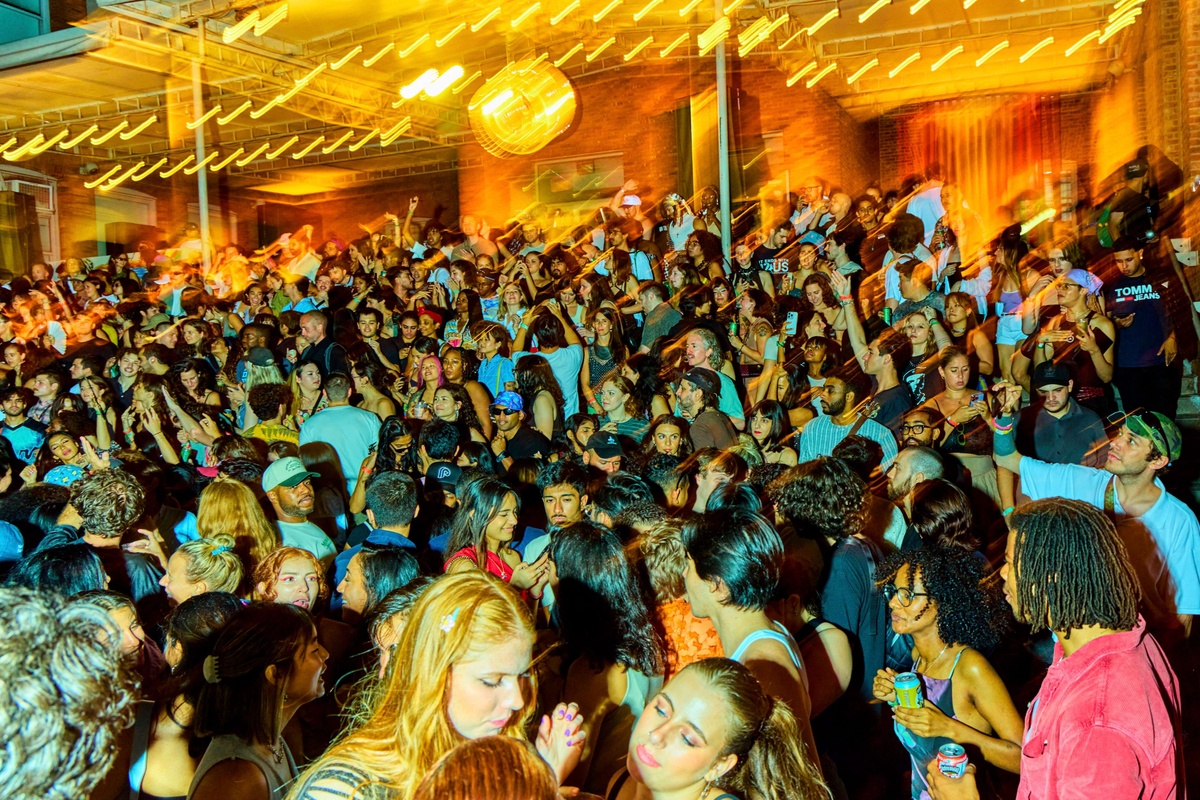
The second part of Joyal’s commission comprises an ephemeral sculpture that rhymes with the crowd of music fans that gather each Warm Up. Spinning LED lights spell out the names of popular dance moves and crazes that originated across the US through the 1940s and 1950s in The Jerk (2025). Drifting atop a deconstructed stage festooned with banners, the animated text serves as a silent “caller” for Warm Up’s festive weekly proceedings, linking the DJ booth’s music-box character to past and present moments in which the rebellious exercise of collective movement has spread through youth culture to spark social change.
Below, Joyal joins Kari Rittenbach, Assistant Curator at MoMA PS1 and an organizer of Warm Up 2025, for a conversation on Americana, obscenity, and the albums that have shaped his practice.
Jeffrey Joyal (American, b. 1988)
Untitled (Scene du Jour)
2025
Woodcut prints, paper, wheat paste, and plywood
The Jerk
2025
OSB, canvas, holographic fans, and hardware
All works courtesy the artist
What is your relationship to printmaking, and to woodcuts, more broadly?
I’ve been printmaking from a young age. I started making linocuts when I was a kid. I’d make flyers for punk house shows. I was an avid doodler. The graphic nature and that DIY craft aspect of a block print drew me into the process. This “Bikes-Not-Bombs” aesthetic. There’s something inherently direct and political about the history of printmaking in the 20th century. I’m interested in engaging with that. Without going too deep on that subject I would also say that looking at artists like Käthe Kollwitz, José Guadalupe Posada, or Emory Douglas when I was younger really solidified the urgency of printmaking. Seeing the Kollwitz retrospective at MoMA last year was really affecting.
Can you speak about your collection of clip art and ephemera that informed the prints you made for Untitled (Scene du Jour), 2025?
The main image that I used is this sort of art nouveau spindle of hair. It reminded me of a knock-off Aubrey Beardsley or Alphonse Mucha poster. Like, an acid, Haight-Ashbury version of that. When I was working on my last show in New York, I was buying these deadstock posters in bulk from a dealer in San Francisco that I would print on top of. He sent me the posters rolled in a tube, bound together by this torn section from another poster wrapped around them with a piece of artist’s tape. That fragment is the image. A lot of my work builds from these happy coincidences. I tried to figure out how to work that fragment of a poster into something for nearly four years. When you approached me about the set design for Warm Up, it felt like the right moment. There is another print with an image of a button that reads: “Are We Having Fun Yet?”. It’s a badge somebody would wear on their jacket that I found on eBay. I’m always looking out for stuff like that. And I thought it was an important question to pose to Warm Up attendees this year.
In terms of pure aesthetic distillation, for me, important record covers in the history of art include Andy Warhol’s banana peel for The Velvet Underground & Nico (1967), and Gerhard Richter’s Kerze, 1983, for Sonic Youth’s Daydream Nation (1988). What album cover would you say has been most influential on your artistic or musical practice; Or conversely, what album (full stop) has been?
I actually had this Velvet Underground box set when I was a teenager with a banana on the LP that you could peel off–like the original release. Warhol also did the artwork with the zipper for the Rolling Stones’s Sticky Fingers (1971). I love an interactive album cover: the spinny wheel in Led Zeppelin III (1970). You know Gee Vaucher’s collage art for [the UK anarcho-punk band] Crass was very influential to me. That also comes out of the tradition of political printmaking I was talking about as well, though it’s just a bit different. It’s that same graphic, urgent imagery in stark, shadowy violent blacks.
You know what I am actually thinking of is the Dead Kennedys record Frankenchrist (1985). The original proposed art was done by H. R. Giger. It’s this piece called Penis Landscape (1973). It’s not even that I’m such a Giger fan. The label wouldn’t let them use it so they stuck it inside as a poster. The LP cover ended up being a picture of these Shriners [members of a Masonic society] in their little cars. Kind of a fuck you to the label. This art kicked off the Tipper Gore/Parents Music Resource Center music-censorship hysteria in the early ‘80s and ultimately led to the advent of the Parental Advisory label. Jello Biafra [of the Dead Kennedys], was brought to trial for obscenity because of the poster. On top of that, they were sued by the Shriners in the found image because they didn’t have permission to use their likenesses. I love this story. This to me has a lot more to do with my practice than any singular album cover.
Tell us about your sculpture, The Jerk, 2025. Have you worked with text in this way previously, or with this particular text?
I’ve worked with text before in various artworks but never quite like this, not in video form. I made a big piece for a show in New York a while back called The Narcissists Prayer (2019) where I made linocut prints on a large scroll of paper and wrote a little rhyming poem. The text includes phrases like: “pore mote,” “war haute,” “deplore bloat,” “more rope,” that shimmies and waves and folds into and out of itself. I always thought of it as a concrete poem. So The Jerk is a continuation of that process. I picked a bunch of different names of dance crazes from the ‘50s and asked a friend to help me animate them in various fonts that I pulled off a bunch of Chubby Checker records so that they would do a little dance. I love the design of these album covers from Parkway Records. I like the repetitiveness of the “The” at the beginning of each dance: “The Jerk,” “The Bug,” “The Watusi,” “The Bunny Hop.” It’s a long poem that dances.
In discussing this year’s stage design, we spoke about carnivals and “Big Tent” gatherings with stages and live music as having a particular American history, from 19th-century revivalism through the Summer of Love and Robert Altman’s Nashville (1975). Your reference material for The Jerk originates from the period when bebop and The Blues were becoming mainstream via radio airplay (and Chess Records). Those sounds proliferated widely within the US and beyond. Can we still discuss “Americana” in the 21st century?
I think it’s important to interrogate our culture so we can find our own place within it, and art is the only way I know how to do so. My music really comes out of improvisation, so in my art I can be more deliberate. Although I use imagery and material associated with mass media, my practice comes from a really personal place. Ideally, one expansive enough for other people to bring their own ideas and experiences to.
