MoMA PS1

Whitney Claflin Audio Guide

  • Audio

Continue to Page to Keep Reading

The following is an excerpt of the full page

Whitney Claflin. Ten Nineteen. 2019. Oil and graphite on found fabric. Courtesy the artist and Derosia, New York

Hear Claflin discuss her work
:
Introduction

Time remaining:

Hi, I am Whitney Claflin, and this is my exhibition, I was wearing this when you met me, at MoMA PS1.

It’s titled, I was wearing this when you met me for a few reasons. It’s an abstraction of how I remember the first time I ever heard Kate Moss speak, which is in a CK Be commercial from the early nineties. She’s telling this story of having a disagreement with a gentleman about how she’s dressed too sexy or something, and she’s saying, “When I met you I was wearing a skirt on up to here,” you know, gestures pretty high up. “You didn’t have a problem with that then.” And he’s like, “Oh, well, that’s ‘cause I didn’t know you then.” So it kind of goes back to these ideas of control and a little bit of feminism. And then also just the idea of hearing my idol speak for the first time, this model who existed purely two-dimensionally. I make a lot of my work out of my own clothing and old jewelry and other things. So it’s sort of like this idea of looping and folding back where it’s like, “Oh yeah. I’ve been wearing this for like eight years. You totally have seen me in it before, and now it’s a painting.”

S. Garden, which stands for Secret Garden, is made exclusively out of stuff I’ve found in thrift stores. The star shaped stickers I found at My Unique in Jamaica, Queens. I’ve used them in other paintings, and I kind of liked that it’s this vintage prefab thing. I can have my own little like lexicon of shapes and things travel across works, the same way I can use Mars Black in three different paintings or Faoh glue or something like that. So it’s like a ready-made material. The thread is a glittery accent thread that’s incredibly difficult to work with. And the masking tape, I think that’s also from My Unique, but it reminded me of the Piro foam tape, and I was like, “This is cool. It’s kind of like I have another ready-made material that feels my language.”

The painting has layers to it. There’s a satin rayon, bright red, and then an interference, sheer fabric on top. So it’s like a red and green combined knit. So depending on what angle you’re looking at, it’ll look kind of coral pink or mossy green.

I use interference pigments when I’m oil painting. The oil paint has this iridescent quality to it. Even though I’m using different supplies and materials, they can have a unified overall effect, which is exciting. I feel like that’s also how the world is. There’s all sorts of different textures and things you’re encountering, but they can somehow have a unified surface in some way. That’s just like a city living phenomena, I feel like, visually.

There’s like a little tear in the interference fabric on top, and I decided to work with that as a little suture. If you think about the painting as a body or a person or a being, like it had sort of just gotten a little booboo over time. The tape on the side is just sort of a way to let the viewer know, it’s a really wacky Wabi-sabi. I’m acknowledging the repairs of making and existing. All that stuff is not hidden. It’s sort of incorporated into the experience.

The Ice Dealer is taken from an advertisement from I believe the seventies or eighties, on the side of a big building in the main shopping plots in Mönchengladbach. Ice cream is a very big thing in Germany, which I didn’t really realize before going there for 10 months. Around the corner from where I was living was an ice cafe called The Ice Dealer and they made their own waffle cones and the smell would just like waft into my studio. And it was truly lovely.

But that painting kind of came around in a very roundabout way. It started as a large all over abstraction. When I don’t exactly know what to do, I’ll say, what if it was just about color? And so I start just with color and the premise for that was neon orange, burgundy and black. I think they’re kind of like a perfect putrid combo and so I was like, “Alright. We’ll just start there.”

And then the painting just kind of kept going in different directions. And finally this sort of figure emerged that reminded me of the figure on the exterior of this building, this mural advertising an ice cafe. So I just sort of leaned into that and that’s where the ice cream sundae comes from. It’s part of this mural in Mönchengladbach.

The video with Dallas BBQ and Pulp is called Chelsea, because I filmed it at the Chelsea location of Dallas BBQ and it was early on in the reopening of indoor dining and that sort of thing, so you can see in the bottom corner there’s like a little reflection that’s coming off of one of those covid plexi safety screens. It’s the Chelsea neighborhood of New York. And then the music video, the Pulp video is “Common People,” which refers to Chelsea, a posh neighborhood in London.

I have a really strong connection to Pulp. I had all the posters and all the memorabilia and the European imports. When you’re 13 and you pick a super passion. I was just very into Pulp. So when this video popped up, I was just like, “Oh my goodness.” Because the formal or visual unity of the Pulp Neon and the BBQ Neon, I was just like, “Well this is just great.”

I filmed it because I was like, “I know I have to do something with this eventually, I just don’t know what it’s gonna be yet.” And then I started to see I could make a gif out of it. So I slowed it down and looped it in this one portion so that it kind of can behave like a lava lamp. Jarvis Cocker sort of becomes the goo in the lava lamp.

Untitled (For Janelle) is a painting of the store on Broadway, Necessary Clothing. It’s like a Forever 21, plastic knockoff, flammable club clothes kind of place. The store’s been there for a long time, so they haven’t updated the interior signage. And they had these two huge square photos in the back above the dressing rooms of this woman, Stacey Janelle Thompson, I believe is her last name. She was like the model in the early nineties. So she was all over Delia’s, Alloy, Seventeen, and, I mean, I was just obsessed with her.

So when I moved to New York, I saw those photos of her and I was just like, “Oh my god, blast from the past. I’ll go in and get some flammable tight dress and see the photo of that lady that I like and that’ll be a nice afternoon.” Finally in 2021, I noticed that the store was kind of heading in a closeout direction and I was like, “I gotta take a photo of this ‘cause it’s not gonna be here forever.” Basically it just took me four years to finally make the painting of it.

For this style of painting, I use a projector and I trace it out in this very special red colored pencil. It’s like an old, traditional drafting pencil for commercial design use and they don’t make them anymore. And then I go in with basically just transparent oil colors. Nothing that would be opaque. And do these thin washy layers that kind of give it a more fashiony effect. A lot of my paintings are very dense and dank and take months and sometimes years to make. So I think of this as the salad to the like chili or stew or gumbo of some of the other works. Also just a way to commemorate this store that might not be with us at the close of this exhibition.

These drawings are from a book of poems I wrote called Food & Spirits. All the poems had something to do with either food or beverages or places that don’t exist anymore. Ghosts from my past. I divided the poems in Food & Spirits into chapters and then selected things I was going to make illustrations of to harness each chapter.

The yogurt drawing refers to, in high school I was one of those bad vegetarians that didn’t know how to eat. I just ate a lot of yogurt and was like really malnourished. So that’s kind of like this perseverance idea for me.

The matchbook from Jones, it was a birthday present for a friend. It’s not there anymore. I think one of the guys from Yo La Tengo was a bartender there and then sometimes Mark Ibold from Pavement would be bartending there. They had really good chili. It was just so perfect and good. You could always have a good time there. You never had sticker shock with the bill. I had definitely gone there, gotten a beer and written poems on my phone before, so it felt very important to make note of that.

And then Mexican Radio, same thing. I was like, “I have to draw their matchbook because they are no longer there.” And they had the best $5 happy hour ever. It was a $5 margarita and $5 plate of nachos. Definitely wrote some poems at their bar during happy hour as well. Those bargains did not withstand the changes that downtown New York went through.

The Heidelberg is still up there on the Upper East Side. But they have probably one of the most iconic matchbooks in the city so it had to make it into the book.

Dickies is on a cotton fabric. I covered it in so much gesso and primer that the fabric became more like a relief sculpture. So it’s like I’m almost thinking of it more in relationship to an Eva Hesse painting coming off the wall. And like it’s so stiff you could throw it like a Frisbee and I’m into it having that objecthood.

And then I did a carbon transfer trace of the Dickies logo because at the time that was really big in street wear, but it’s also work wear obviously. I mean that’s like a very taken for granted almost juxtaposition that I feel is built into it. I guess I just saw it as like very emblematic of like “bro” at the moment. And then colored it in a little bit with a ballpoint pen and then did a super gloss varnish on it.

This idea of cotton workwear, transforming those materials into a very glossy, firm, high sheen object. I was thinking of the interface of Grailed and how it’s this super polished interface for all this kind of secondhand stuff that people are trying to hype up because so much of living in New York is built on having a secondary income or mobilizing your own waste to like make ends meet. Or like purchasing things in anticipation of selling them and that’s a really weird way to grow up, starting in your twenties or something. That kind of contrast to like the collector energies of sort of where my millennial hits Gen X. I just feel like I never got a chance to be a collector or something. And so then the title is Final Drop because that’s when someone on Grailed announces, “this is the lowest I’m willing to go.” And I think we’ve all hit that point at some point or another.

Déjà Vu was made in Monchengladbach in Germany, which is in North Rhine-Westphalia. It’s a very, very small town and there’s a bar at the top of the one hill in the Alter Markt which is called Déjà vu. That kind of became my local while I was there for, I think it was 10 months. The bartendress was so wonderful and nice and the vibes were really good and they had those free, local magazines. And so I just started getting those and then I saw that Déjà vu had placed a quarter page ad. I cut that out to collage into a painting. I kind of just let the painting sort of tell me what to do.

I knew that I needed one to behave kind of like a black hole. That felt appropriate to the space. You walk by at noon and there’s already the cast of regulars outside and then the cast of regulars inside and you’re like, “Oh no, it’s like a gorgeous day. You should get outside.”

Also, yeah, it kind of has the hellraiser edges. A common thing I would see in paintings in Germany is the sides of the stretcher bars, you see the visible brass tacks. And so I was kind of riffing on a lot of the art that I was seeing in the Rhineland. I mean there’s a lot on view from the eighties and nineties out of Cologne in that region. These like, you know, haphazard bar driven approaches to painting. I was sort of jovially running along with that tide.

And then, I experience déjà vu a lot. I’m a lucid dreamer. I listen to music on loop and repeat. It’s very like a flow state. So it’s kind of like all those things. It’s like indicative of how when I want the paintings to be able to be quilt-like, or mix and match, it should be able to do what it needs to do on its own. But when you interject it with other works, it can enhance them and they can enhance it.

Academy Records is a longstanding, good, mainly used record store. The buying that they do is good. You’re not sifting through a lot of duds there. But yeah they’re just a special good old New York institution.

The Academy Records painting. It’s from October, 2019 ‘cause the title is Ten Nineteen. It’s the way they price new arrivals in used records is with the date. So, you know when it entered the store. I believe they do still have dollar records, but I didn’t see any that day and it was a $2 bin and it just kind of made me laugh. Hashtag inflation, it’s like there’s no dollar bin anymore. It’s the $2 bin now. Or the dollar slice is gone. The death of the dollar bin, the death of the dollar slice.

So it was sort of like recording time and price changes. That painting is maybe more like a spreadsheet than anything else. But also just the fact that Academy is still going is remarkable and I want to honor them and the immortality of oil paint felt important.

Six Delancey is the address of the Bowery Ballroom. In previous paintings, I had taken wristbands from concerts or parties and sewn them directly into the work. But I did not want to do that with this one. So I tried to make, in my like drippy fashion, glyphic style, a painting of the Bowery Ballroom wristband from like a photo of it while someone was wearing it. And that painting just got overworked. It didn’t turn out so good. Oftentimes when a painting doesn’t quite work in the way I wanted it to, it takes a left turn. I covered over it in like a thin white paint and then pulled out colors that I could see underneath and then added new ones and so then it became like a textural atmospheric abstraction. The way this paint has combined on the surface creates the effect of what I was trying to conjure with the wristband. It just doesn’t exactly look like the wristband anymore.

In Use is similar. It started as a photograph of a bathroom wall. That one’s at Big Bar which is in the East Village, just a little further north of the Bowery Ballroom. I knew I was more excited about the way the neon green and the purple were interacting with the black. So I just sort of again, like abandoned what I began with and let the painting do the talking.

Some of my most favorite shows that I’ve seen in New York have been at Bowery Ballroom. And then Big Bar similarly I guess, I had a friend that bartended there for a little bit and it was sort of just one of the first bars that I started going to when I moved to New York. I’ve celebrated Christmas Eve there. There’s also other places and other works in the show that don’t exist anymore. So it’s special that these places do.

The project started when I was in New York and I had more ideas for paintings than I did surfaces. And I also knew that I needed to paint through a lot of things. They didn’t need to be on precious surfaces, so I started painting on empty wine bottles. I was kind of interested in the dichotomy between the surface and the care with which I was making the painting.

I had an opportunity to live in Los Angeles, so I sort of picked up and went and thought, well what am I gonna do while I’m here? And I thought it would just be really cool to kind of drop out in a sense and not exhibit the paintings in any sort of typical venue. There’s vendors at Venice Beach that set up and sell stuff there. So I would bring them to the beach and then set up a little tarp blanket thing to sit on. In order to let people know what I was selling on my blanket, I made this sign: hand painted flower vases. Many of them would glow in the dark. I was using a glow in the dark rustoleum enamel.

They didn’t sell very well. I think I sold maybe like five, but it was sort of just more about the action of going out there and sitting all day and getting to know the other people and it was a cool community. They would watch your area while you would go to the bathroom, or I would keep an eye on theirs. Maybe the scariest thing is that you’re at face level with the dogs. There are just some scary dogs sometimes. Other than that it was a really benevolent environment. Yeah it was just sort of a way for me to put the painting into the world in a non-traditional way.

MoMA PS1

Yto Barrada on Le Grand Soir

  • Video

Continue to Page to Keep Reading

The following is an excerpt of the full page

Directed by Nora Rodriguez; Filmed by Elle Rinaldi; Video Editing by Elle Rinaldi; Audio by Nora Rodriguez; Graphic Design by Julia Schäfer; Music: Tendril by Dan Langa, Floretin by Blue Dot Sessions, Bivly by Blue Dot Sessions

The tower. The flower. The door. These are the names of the acrobatic formations to which Yto Barrada’s colorful sculptures pay tribute, acknowledging Morocco’s rich history of human pyramids.

Used during battle to see over walls and enemy lines, human pyramids transformed acrobatic movements into warrior traditions. Barrada’s sculptures play off architecture—both human and concrete. Discover them for yourself when you visit MoMA PS1, and watch the installation come to life in this video.

MoMA PS1

Through the Open Window

Ralph Lemon and the Legacy of Dance at P.S.1
  • Texto

Continue to Page to Keep Reading

The following is an excerpt of the full page

The choreographer, writer, and visual artist Ralph Lemon has likened the presentation of dance within a contemporary art museum to the event of a bird flying unexpectedly into a house through an open window. There is a disorienting change in air pressure and temperature from the perspective of the bird, and a dizzying disruption of atmosphere for those already in the room. A potentially productive meeting arises from two very different positions.

On the occasion of Lemon’s major solo show at MoMA PS1, Ceremonies Out of the Air: Ralph Lemon, exhibition curators Connie Butler, T. Lax, and Kari Rittenbach placed equal emphasis on the drawings, films, sculptural objects, and remnants made by Lemon and his collaborators, and the ambitious program of performances rehearsed on site and staged monthly for museum audiences. The ebb and flow of Lemon’s ceremonies engage with the material traces occupying the very same building. In some cases, art objects and sonic elements even travel between the porous realm of live performance and the secure climate-controlled room—virtuosically upending the values conventionally held in either setting.

MoMA PS1

On Bungkalan and Butterflies

Enzo Camacho and Ami Lien in Conversation
  • Texto

Continue to Page to Keep Reading

The following is an excerpt of the full page

Enzo Camacho and Ami Lien. Flame Garden (bruised) (detail). 2024. Watercolor, ink, beeswax, abaca pulp, bagasse, banana stalk, cilantro, coconut, cogon grass, fennel, kale, leek, onion skins, primrose petals, rice hull, sargassum algae, seashell, seaweed, spring onion, statice blossoms, and taro shoots. Installation view of Enzo Camacho and Ami Lien: Offerings for Escalante, on view at MoMA PS1 from October 10, 2024 through February 17, 2025. Photo: Steven Paneccasio

For over a decade, artists Enzo Camacho (Filipino, b. 1985) and Ami Lien (American, b. 1987) have amplified local forms of survival and resistance, with particular attention to the Philippines. On the occasion of their first major US museum exhibition Offerings for Escalante, on view at MoMA PS1 through February 17, the duo discuss their historical and material research on the island of Negros, with both documentary and indexical approaches to embodying the land. Camacho and Lien’s interests materialize in two of their recent works on view in the exhibition, Langit Lupa (2023) and Decomposition Animation (2023), which recently entered the collection of The Museum of Modern Art. The conversation with Chief Curator Ruba Katrib triangulates the social and environmental concerns of artists and activists across The Philippines, its diaspora, and New York.

MoMA PS1

Ceremonies Out of the Air: Ralph Lemon

  • Texto

Continue to Page to Keep Reading

The following is an excerpt of the full page

Accompanying the first US museum exhibition dedicated to artist, dancer, and choreographer Ralph Lemon, this catalogue features works across diverse media, including sculpture, film, drawing, and major ensemble performances that emerge in the afterlife of postmodern dance. As a “devotional” handbook for the PS1 show, Ceremonies Out of the Air traces the arc of Lemon’s ongoing collaborations, which extend far beyond the paradigm of dance. It includes essays by exhibition curators Connie Butler and Thomas Lax, as well as newly commissioned essays, texts and contributions by Kevin Beasley, Adrienne Edwards, Darrell Jones, Ralph Lemon, Okwui Okpokwasili, Pope.L, Kevin Quashie, and Kari Rittenbach. Featuring a dust jacket that unfolds into a poster, the book includes more than 100 full-color illustrations of Lemon’s artworks, performance documentation, and sketches.

Order now

Edited by Connie Butler, Thomas Lax, Kari Rittenbach, Jody Graf. Text by Butler, Lax, Adrienne Edwards, Darrell Jones, Ralph Lemon, Okwui Okpokwasili, Pope.L, Kevin Quashie, and Rittenbach. Contribution by Kevin Beasley. Designed by Julia Schäfer and Asel Tambay.

MoMA PS1

Jerry the Marble Faun

Artists Make New York
  • Video

Continue to Page to Keep Reading

The following is an excerpt of the full page

Filmed by Elle Rinaldi ; Video Editing by Elle Rinaldi; Audio Recording by Nora Rodriguez; Graphic Design by Julia Schäfer; Music: Etude 13 LaSalle by Blue Dot Sessions (www.sessions.blue); Original score by Dan Langa

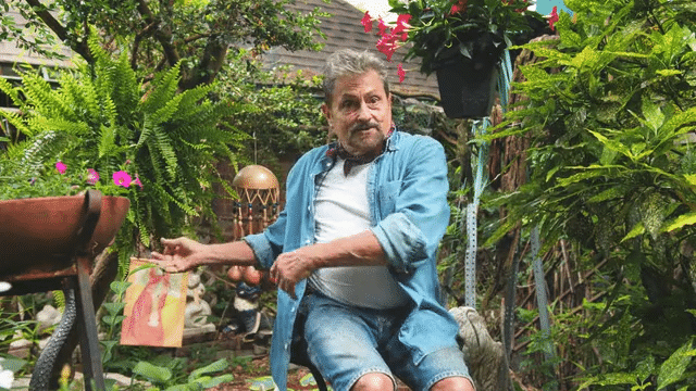
Jerry Torre has lived in Sunnyside, Queens for 25 years. When he moved in, this garden was weeds and concrete. He slowly transformed it into a verdant respite—and it wasn’t his first time! You may know Jerry as the gardener of Grey Gardens, where he earned his nickname: Jerry the Marble Faun. In addition to his excellence as a gardener, Jerry carves sculptures from stone sourced from demolition sites around New York. His intricately carved limestone works are now on view in Hard Ground through October 14, 2024.

MoMA PS1

Melissa Cody on Weaving and Video Games

  • Video

Continue to Page to Keep Reading

The following is an excerpt of the full page

Filmed by Elle Rinaldi; Additional footage courtesy of the Hammer Museum; Video Editing by Elle Rinaldi; Audio Recording by Nora Rodriguez; Graphic Design by Julia Schäfer

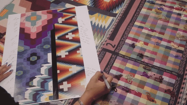
Navajo weaving has always reflected the culture and politics in which it was created. And when you grow up in the 1980s, that culture includes Mario Kart, Pac-Man, and Contra. See how Melissa Cody’s vibrant weavings draw from her childhood mastery of video games, and how the artist joins a long lineage of innovation and evolution in weaving tradition.

MoMA PS1

Warm Up Cassette Tape Archive

Kari Rittenbach and Nick Scavo on Montez Press Radio
  • Audio

Continue to Page to Keep Reading

The following is an excerpt of the full page

“When I first started at PS1, this was one of the first things you showed me,” remarks Nick Scavo, MoMA PS1 Senior Project Manager, Music, Performance and Events. “This mysterious box with tapes, floppy disks, flyers. There’s a beer koozie in there as well.”

Scavo joins MoMA PS1 Assistant Curator Kari Rittenbach and Thomas Laprade, co-director of Montez Press Radio and member of the 2024 Warm Up host committee, for a listening session of cassette tapes sourced from the museum’s archives. The tapes, many of which are partially or totally unlabeled, include recordings from some of the earliest Warm Up performances in the PS1 courtyard.

Warm Up began in 1998, just one year after rewritable compact-disc technology became widely available as a digital storage solution. Hear Rittenbach and Scavo discuss the evolution of Warm Up and the audio integrity of cassette tape ribbon, alongside commentary from special guest and former PS1 Curatorial Assistant Maika Pollack, now Executive Director and Chief Curator of the Syracuse University Art Museum. Listen to the conversation on Montez Press Radio or below.

Hear Kari Rittenbach and Nick Scavo on Montez Press Radio

Time remaining:

MoMA PS1

In Conversation with Reynaldo Rivera

The artist speaks with Lauren Mackler and Kari Rittenbach
  • Texto

Continue to Page to Keep Reading

The following is an excerpt of the full page

Reynaldo Rivera’s work has immortalized the colorful figures circling through his orbit since the early 1980s, when he first began using his camera to record their dreams and desires. His photography refutes the medium’s specious objectivity, reflecting the atmosphere of the surrounding environment by making use of available light—both natural and artificial—as well as shadow.

Rivera’s first solo museum exhibition, Fistful of Love/También la belleza, includes never-before-seen photographs from the artist’s archive, alongside a film newly edited from Hi8 footage. His photographs—which are included in MoMA’s collection—are informed by the drama and deep emotion of boleros and rancheras, the glamor of Old Hollywood and the Golden Age of Mexican cinema, and earlier trailblazers in photography like Nadar, Brassaï and Henri Cartier-Bresson. Rivera joined guest curator Lauren Mackler and MoMA PS1 assistant curator Kari Rittenbach to discuss the exhibition, revealing the stories behind some of his subjects (often friends or lovers), what it means to publicly exhibit his very personal “blue” series, and the experience of looking back on the past three decades of his work.

Read the full conversation at the link below.

MoMA PS1

Stewart Uoo’s Set Design for Warm Up 2024

Finding Harmony Within Chaos
  • Texto

Continue to Page to Keep Reading

The following is an excerpt of the full page

Photo credit:
Ryan Muir

Stewart Uoo
(American, b. 1985)

Contemplating Non-Dualism IV (Triptych) 2024
Acrylic, pigment, and collaged canvas

Used Sun (Eclipse) 2024
HDU foam, epoxy, glass and acrylic tiles, hardware, and motor

Untitled (After Tony Walton for Diana Ross: Live In Central Park 1983) 2024
Silk, thread, acrylic paint, epoxy, and glass tiles

Set design for Warm Up
Courtesy the artist and 47 Canal, New York

For this Warm Up season, New York City-based artist Stewart Uoo conceived a three-part modular setting for the museum terrace: a spinning mirror-tiled sculpture, hanging panels of brilliantly dyed silk, and a psychedelic DJ booth to be graced by performers in MoMA PS1’s iconic summer music series. Riffing on the alternate history of New York School painting as backgrounds for dance theater and social performance, Uoo stains the Warm Up stage in a summery palette of radical optimism. With references that include both canonical and subversive artistic interventions in the performing arts—by Cy Twombly (Bacchus, 2011) and Martin Wong (Peking on Acid, c. 1970s), among others—the main components of his outdoor installation approach the scale of architecture via painting. Suspended at the center of the installation, a custom sculpture based on a found tire flaunts inlaid mirror tiles that cast luminous track prints in their wake. Uoo’s polychromatic triptych on the DJ booth doubles as a conceptual altarpiece, encouraging crowds to dissolve into the light, haze, and heat each Friday night—and let the rhythm take over.